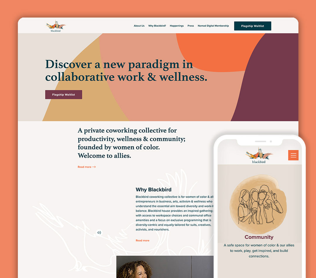
Eat Sleep Work was approached by our long-time client, Bridgid Coulter, with an exciting new venture—a coworking space specifically for women of color and allies. They needed a complete branding overhaul, starting with just the name “Blackbird,” inspired by the iconic Beatles song. Our goal was to create something truly meaningful that embodied the essence of the name and the project.
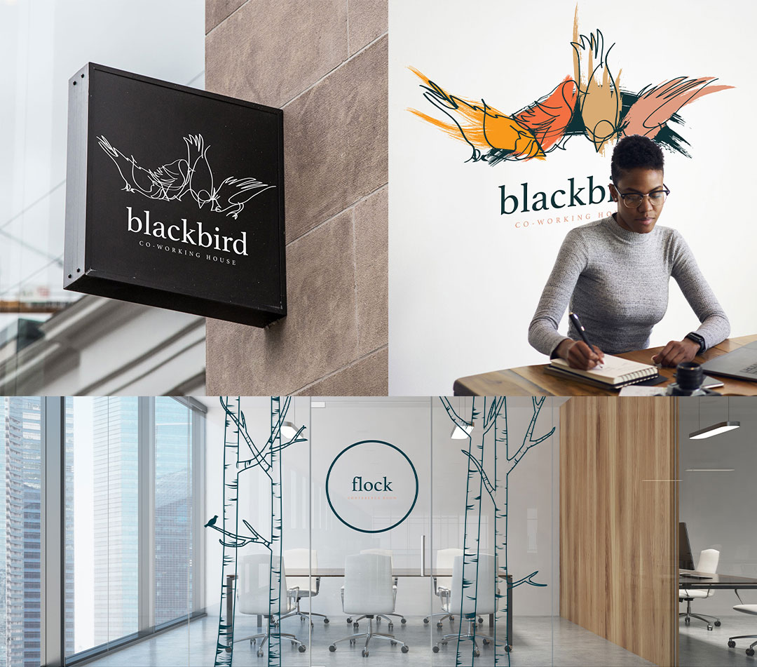
Eat Sleep Work was responsible for crafting the branding and logo design for Blackbird House.
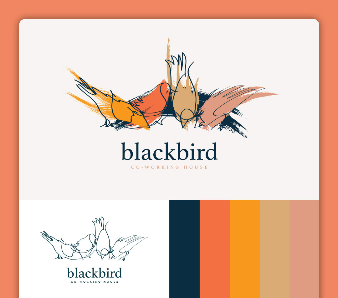
The logo design process is an intricate journey that begins with thorough research and discovery. When it came to Blackbird, a term with generic associations, we delved into the realm of existing companies that shared the same name. Our aim was to identify where we could carve out a distinct identity for the new brand.
Once we gained insights from the styles prevalent in the public space, we embarked on the creative exploration of our own unique options. From delicate watercolors to sleek line art and even a bold geometric aesthetic, we left no stone unturned in our pursuit of the perfect design.
Through a series of iterations and refinements, we amalgamated all the diverse styles into a single logo that symbolizes the breadth of diversity in women. This final design stands as a testament to our dedication in capturing the essence of empowerment and inclusivity.
With meticulous attention to detail and a passion for creativity, our logo design process is an artful blend of research, innovation, and storytelling.